Summary of Project
In my Interaction Design course in Fall 2023, I redesigned a website for Toronto Cupcake to improve its user experience and visual design. While researching the website, I noticed an opportunity to give the company's current logo a new, refreshed, modern look. The redesigned logo I created captures the charm of gourmet cupcakes while having its digital presence stand out from the company's competitors.
Step 1: Empathize With Audience
Toronto Cupcake is a Canadian company that provides delicious, mouthwatering, gourmet cupcakes for business meetings, birthdays, weddings, and other special occasions. It has donated cupcakes, time, and care to many charitable causes within the Toronto neighborhood and community organizations.
Toronto Cupcake was opened in August 2010 by Michelle Harrison, who wanted to pursue her passion for baking after gaining inspiration from her mother.
When we think of cupcakes, they represent happy moments in our lives despite being just a tasty, sweet treat. No matter what life throws at us, consuming a cupcake always helps us feel the stress disappear momentarily.
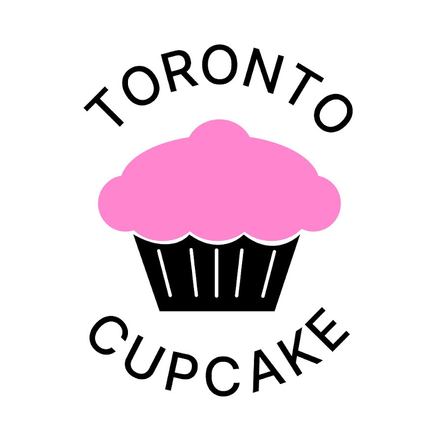
Toronto Cupcake's Current Logo
Step 2: Define The Problem
Toronto Cupcake's current logo and font can be improved for a more visually appealing and modern logo representing the city of Toronto and the country of Canada respectfully.
To solve this problem, I redesigned Toronto Cupcake's logo by conducting in-depth research on Toronto and Canada's historical attractions and attributes.
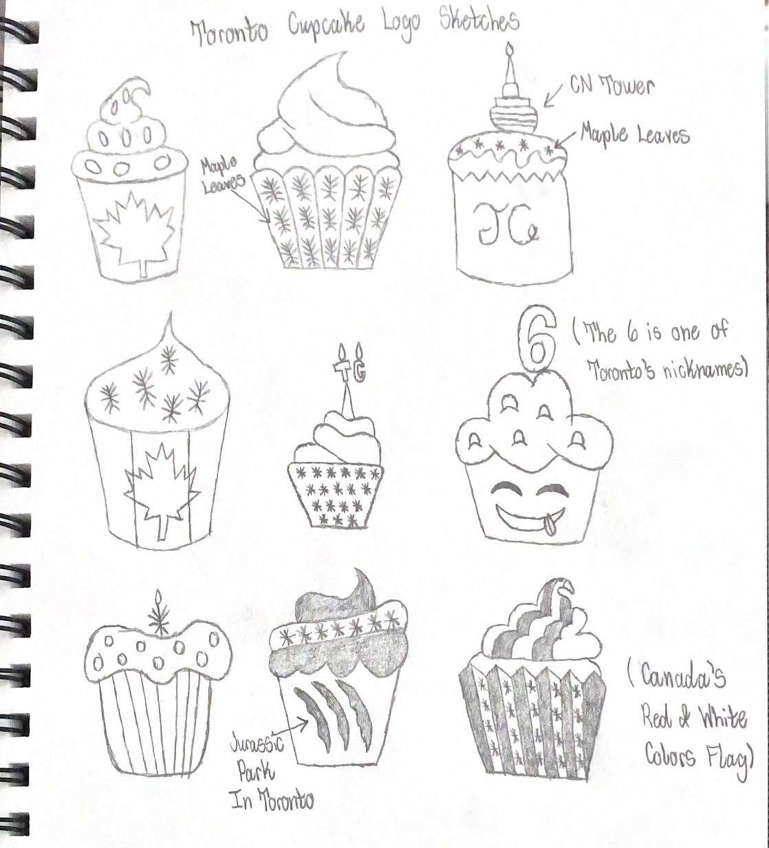
Step 3: Ideate The Problem (The Sketch Phase)
After gathering comprehensive research on Toronto and Canada's attractions, I've produced rough logo prototype sketches to determine which logo looks more representative to Canadian citizens.
The Nine Rough Sketches I've Drawn
After sketching them out, I reached out to people for their opinion on which logo they prefer the most. Based on their preference, I circled three graphical logos to determine which would be the Top 3.
Top 3 Logos
1st Row: Top-middle logo that features maple leaves on the cupcake
2nd Row: Middle-right logo that features the number 6 as the candle with the cupcake having a smiley face
3rd Row: Bottom-middle logo that features claws on the cupcake (Paying homage to Toronto's Jurassic Park)
Brainstorming Phase Continued: The Top 3 Sketches
I redrew the three sketches from the brainstorming phase's first stage to make them look more visually appealing and representative. Some elements, like the CN Tower and the Canadian Flag texture on the cupcake, were incorporated due to being one of the most well-known attributes of Toronto and Canada. After sketching them out, I reached out to people again to determine which of these three would better represent Toronto Cupcake the most.
Here is a picture of the three logo sketches redone:

Step 4: Reveal The Designs
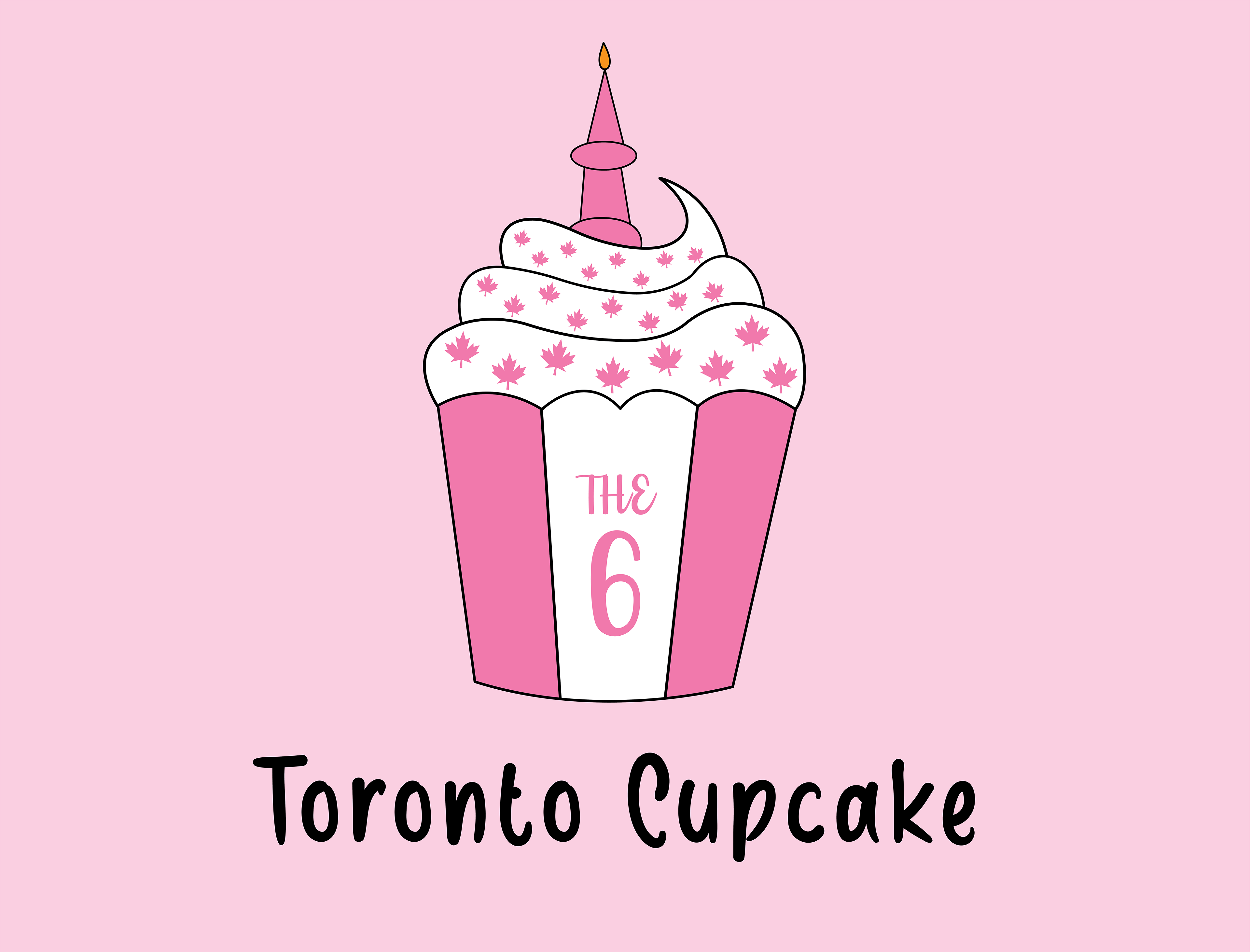
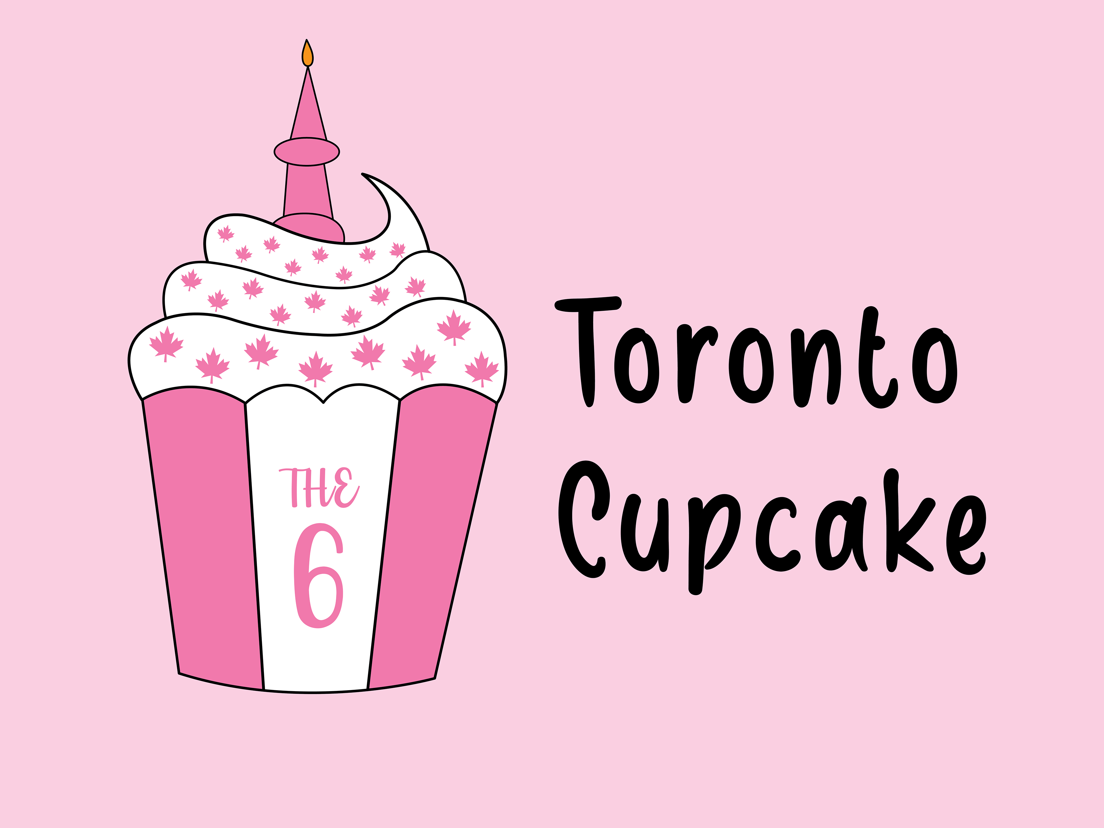

Breaking Down The Toronto Cupcake Logo Redesign:
The CN Tower represents the candle.
Maple leaves are the sprinkles on the cupcake frosting.
Paying homage to the Canadian Flag, the flag reference is on the cupcake with the colors of pink and white (Following Toronto Cupcake's color palette).
The 6, one of Toronto's most well-known nicknames, is incorporated to indicate that the company is located in Toronto.
The typography font used in this design is Brownie Cake, which is created with love, sincerity, and patience. It's also a beacon of creativity that can leave a lasting impression on consumers when buying a mouthwatering cupcake from Toronto Cupcake.
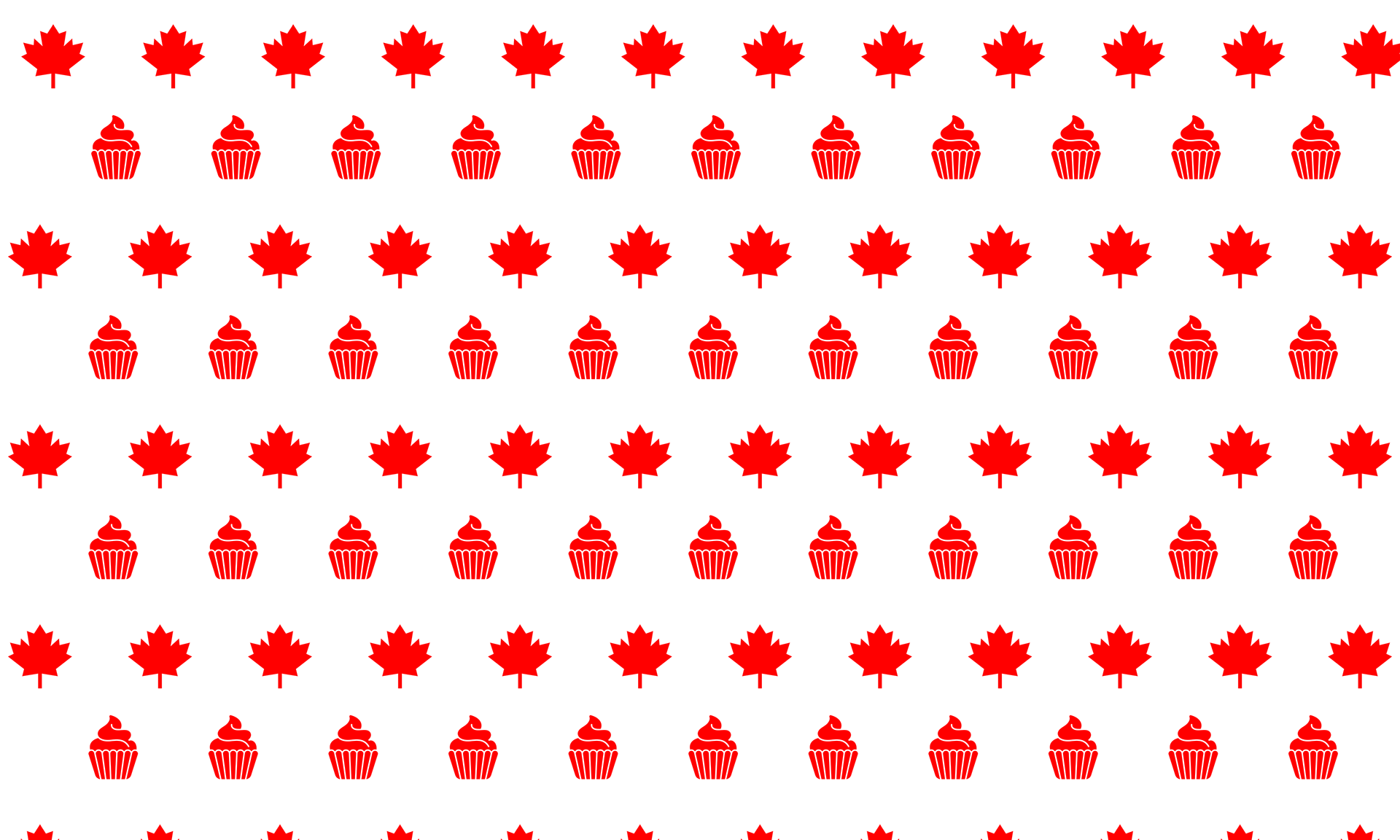
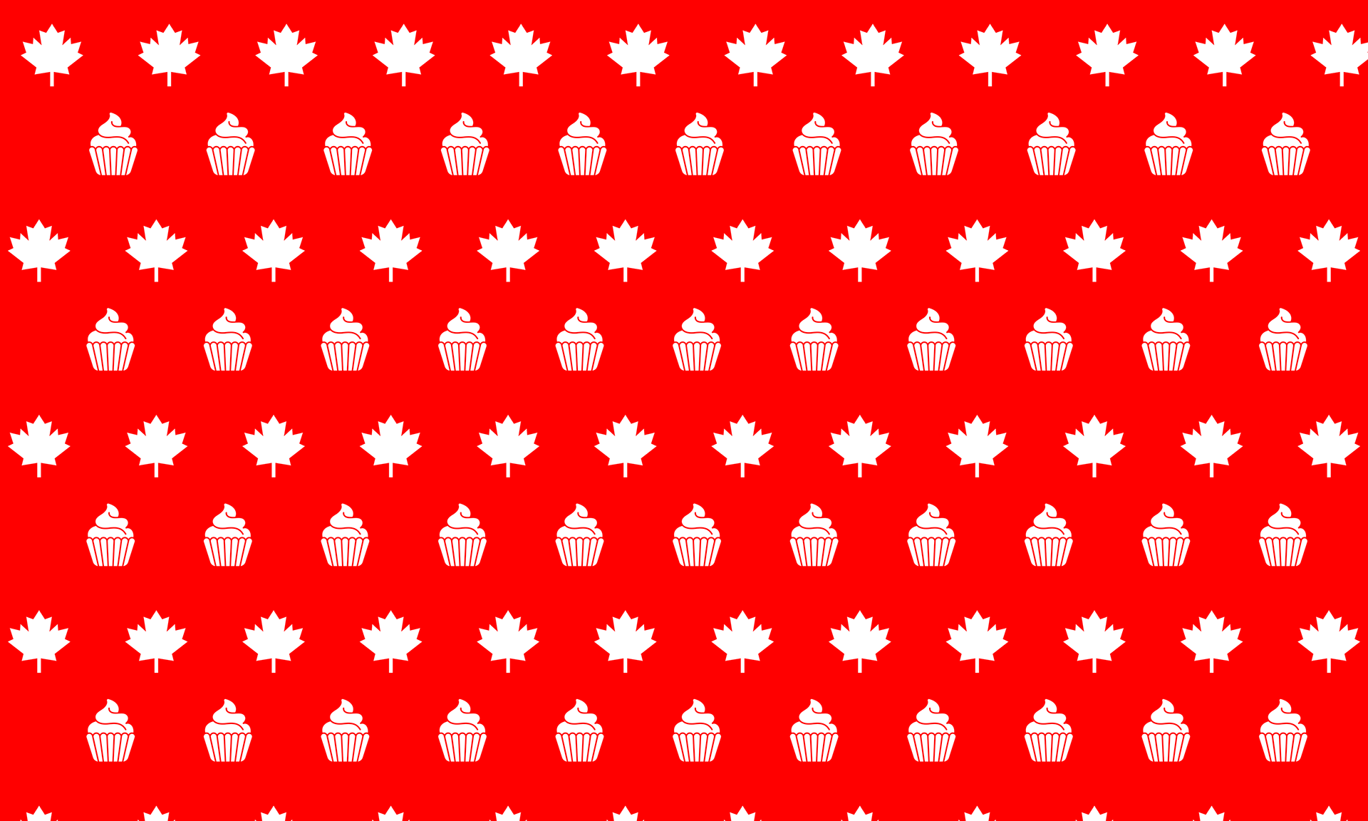
Different Logo Redesign Variations (Canadian Flag Color Palette)
Paying homage to the Canadian flag colors, the colors are red and white; the white color represents winter snows in the country while the red color represents the autumnal maple leaves.


Extra Work: Different Background Variations